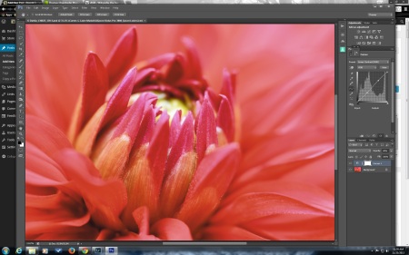
When a friend asked me to enter a print in the “Paint the Town Red” exhibit in my home town I immediately thought of this dahlia I shot at the Swan Island Dahlia Farm in August. Then I had a moment of fear that I couldn’t make a decent print of it.
Red is the one color I have trouble getting to print well on an inkjet printer. Even using the Pro Photo color space, much of the red spectrum is out of gamut. The printer just can’t make the red in the photo and has to shift it to another red color that it can print.
This was an excellent time to work on using soft-proofing in Photoshop. I had seen a recent video tutorial by Joe Brady and learned some new ways to use soft-proofing beyond the minimal way I had used it in the past. Most of my prints look pretty good without using soft-proofing because I have a good monitor that I keep calibrated, but this much red gave me the heebie-jeebies.
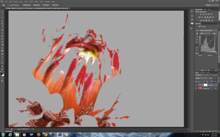
At the top is the original image and below it is the image after choosing soft-proofing it for Epson Luster paper.
This is a screen shot of how much of the red in the image is in gamut on my Epson 3880 printer with Epson Premium Luster paper (the highest gamut paper I could find that I already have). A real eye opener. To get this information you open the image in Photoshop, click on the View menu in the header, select Proof Setup (the first item in the drop down menu) and where it says Device to Simulate in the dialog box that opens you select the printer and paper combination you wish to use from the list, as you would when printing. In my case, I tried several to see which would have the widest gamut. I even downloaded the ICC profile for Ilford Gallery Prestige Gold Fiber Silk paper because I read that it was their highest gamut paper. The gamut warning was much the same with the Ilford paper, though the colors were much more saturated on my monitor using that profile. I found that any paper using photo black ink seemed to have more red colors in gamut than any paper using matte black ink. Interestingly, using Epson Velvet Fine Art paper with photo black ink would have even been a good option, but there is no profile for it on my Epson 3880 printer like there is for the 4900 printer.
Next you go back to the view menu and click on Gamut Warning to see which colors are clipped and which will be fully represented.
Once you have selected your printer and paper in the proof setup dialog box the image will change colors a bit because it can only use the colors your printer can print now, not entire color range in the color space you use. If you save jpegs in sRGB you may not notice much difference at all because sRGB is like a shot glass full of colors, compared to Adobe RGB being a pitcher full of colors and Pro Photo RGB being a bucket full of colors. Take the time to look at each of these color space representations on the right hand side of the page in Wikipedia to appreciate the difference. Especially notice the right bottom corner of the illustration where the reds are and notice how none of the color spaces include much of the reds.
Why use the larger color space if you can’t print all of the colors and when the entire internet can show only sRGB? Because when you work on images in your image editor you are changing pixels and if you pay attention and watch the histogram as you are working you will start to see gaps in it from the damage you are doing. You minimize the damage you are doing with the changes you make when you use the larger color space to work on your images (and using 16 bit, instead of 8 bit). You can then convert a copy of the image to sRGB for the internet, I have my Photoshop do it automatically when I use Save for the Web to save my small internet copies. Inkjet printers can also print using the larger color spaces to get every color you can squeeze out of them. Most commercial photo labs require you to send them sRGB files for their printers. Most photo book printers use CMYK color space, which is best left to the experts for conversion. It is best to save a master copy with the larger color space because once you convert to sRGB you can never get those colors that you threw away back again.
Rendering Intent
If you are like me, it seemed like a crap shoot in figuring out which rendering intent to choose, relative colorimetric or perceptual, in the printer dialog when printing. What I learned in the video by Joe Brady is that soft-proofing is an excellent way to choose which rendering intent to use. That is another selection you can make in the dialog box that comes up when you click Proof Setup. The beauty is that the change occurs while the dialog box is still open so you can toggle back and forth between Relative Colorimetric and Perceptual (the only real choices for inkjet printers) and see which one looks the best.
Technically, relative colorimetric just takes the out of gamut colors and makes them into the nearest color that is in gamut. Perceptual maintains the relationship between colors so as it brings the color into gamut, it moves other colors around as well. The advantage of relative colorimetric is that it maintains the in gamut colors more faithfully, where that is important. People know what color a stop sign is supposed to be and if it comes out pinkish, they will notice. Perceptual is better in images with large areas of color, like a blue sky, because it prevents the banding that might occur if you introduce gaps between colors. The downside of perceptual is that more colors will shift, not just the out of gamut colors.
In the case of the red dahlia I chose perceptual, because the precise color of the dahlia was not important and it was such a large area of one color. Relative colorimetric had a large effect on this particular image because so much of the color was out of gamut.
In the end the print came out too pink for my liking. I also had a blip in my power while the printer was printing (note to self- don’t try printing during a wind storm), so the print had a light band in it and I chose not to try printing it again. I liked the image for the scarlet hue and I was not able to reproduce the color I liked on my printer. Soft-proofing with color profiles for the Epson 4900 printer I no longer have, there is a slight increase in the in gamut colors. The 4900 does use different inks and also has an orange ink cartridge that my 3880 does not have.
I have learned a lot about soft-proofing in the past couple of weeks. I can use it to decide which paper to print an image on (or even which paper to purchase). I have learned how to use soft-proofing to decide on which rendering intent to use on any particular image. I would like to learn more about how to minimize the impact of out of gamut colors on my prints and how to optimize images for the paper and printer I have chosen. I had a lot of problems with that when trying to make a photo book on Blurb last year.There were huge changes to the image when I soft-proofed the images for the CMYK profile they provided and I was just not able to make the images look good.


